Some advanced EDA examples
Extending what we have covered in class
Example 1
This first example utilises a dataset consisting of real road crashes in Victoria obtained from the CrashStats datasets provided by VicRoads. The CrashStats data allows us to analyse serious vehicle crashes based on time, location, conditions, crash type, road user type, object hit etc.
The code below has some wrangling, and then the plots are stored as objects.
library(tidyverse)
library(formattable)
library(kableExtra)
library(ggthemr)
library(chron)
library(dplyr)
library(caret)
library(scales)
library(lubridate)
ggthemr('fresh')

train <- read.csv('VicRoadFatalData.csv')

train <- train %>%
  mutate_if(is.character, as.factor)


train$ACCIDENTDATE <- as.Date(as.character(train$ACCIDENTDATE), format = '%Y-%m-%d')

train$ACCIDENTTIME <- times(as.character(train$ACCIDENTTIME))

train$OWNER_POSTCODE <- as.factor(train$OWNER_POSTCODE)

train$TOTAL_NO_OCCUPANTS <- as.integer(train$TOTAL_NO_OCCUPANTS)

train <- train %>%
  filter(TOTAL_NO_OCCUPANTS > 0)

train$occ_group <- as.factor(ifelse(train$TOTAL_NO_OCCUPANTS <= 7, train$TOTAL_NO_OCCUPANTS, '7+'))

age_counts <- train %>%
  group_by(Age.Group, SEX) %>%
  summarise(non_fatal = sum(fatal == 0), fatal = sum(fatal == 1))

# Calculate the proportion of fatal crashes within each age group
age_counts$proportion <- age_counts$fatal / (age_counts$fatal + age_counts$non_fatal)

age_counts$proportion <- round(age_counts$proportion,5)

#age_counts
age_counts$merged <- ifelse(age_counts$SEX == 'M',
                            paste(age_counts$Age.Group, '', sep = ''),
                            paste(age_counts$Age.Group, '', sep = ' '))

age_counts_long <- age_counts %>%
  pivot_longer(cols = c(non_fatal, fatal, proportion), names_to = 'Crash_Status', values_to = 'Count')

library(scales)

age_gender_plot <- ggplot(filter(age_counts_long, SEX != 'U'), aes(x = factor(merged), y = Count, fill = interaction(Crash_Status, as.integer(factor(merged)) %% 2))) +
  geom_bar(stat = 'identity', just = -0.15, width = 0.8) +
  geom_text(aes(label = ifelse(Crash_Status == 'proportion', gsub('%', '', scales::percent(Count, accuracy = 0.1)), ''),
                y = Count,
                group = Crash_Status),
            position = position_stack(vjust = 0.5, reverse = TRUE),
            color = 'violetred1',
            size = 4.2,
            vjust = -0.5,
            hjust = -0.3) +
  xlab('Age group (years)') +
  scale_y_continuous(breaks = c(0, 5000, 10000, 15000, 20000, 25000),
                     labels = scales::comma) +
  expand_limits(y = c(0, 25500)) +
  ylab('Number of car crashes') +
  ggtitle('Chart 1: Distribution of car crashes by age and gender') +
  theme(text = element_text(size = 12)) +
  theme(plot.title = element_text(size = 12, face = 'bold', hjust = 0.5),
        axis.title.x = element_text(hjust = 0.5),
        axis.title.y = element_text(hjust = 0.5)) +
  scale_x_discrete(breaks = (unique(filter(age_counts_long, SEX != 'U')$merged)[c(seq(1,29,2))])) +
  scale_fill_manual(name = 'Crash Status',
                    breaks = c('fatal.1', 'non_fatal.1', 'non_fatal.0', 'proportion.0', 'proportion.1'),
                    labels = c('Fatal (%)', 'Non-fatal (M)', 'Non-fatal (F)', '', ''),
                    values = c('violetred1', 'steelblue3', 'palegreen3', 'white', 'white', 'violetred1'),
                    na.value = 'violetred1')

helment <- train %>%
  group_by(HELMET_BELT_WORN) %>%
  summarise(fatal_count = sum(fatal == TRUE), non_fatal_count = sum(fatal == FALSE))

helment$proportion = helment$fatal_count / (helment$fatal_count + helment$non_fatal_count)

helment$proportion = round(helment$proportion, 3)

helmet <- helment %>%
  pivot_longer(cols = c(non_fatal_count, fatal_count, proportion), names_to = 'Crash_Status', values_to = 'Count')

helmet <- ggplot(filter(helmet, HELMET_BELT_WORN != 'Other'), aes(x = factor(HELMET_BELT_WORN), y = Count, fill = Crash_Status)) +
  geom_bar(stat = 'identity') +
  geom_text(aes(label = ifelse(Crash_Status == 'proportion', gsub('%', '', scales::percent(Count, accuracy = 0.1)), ''),
                y = Count,
                group = Crash_Status),
            position = position_stack(vjust = 0.5, reverse = TRUE),
            color = 'violetred1',
            size = 4,
            vjust = -0.8) +
  xlab('Seatbelt status') +
  ylab('Number of car crashes') +
  scale_y_continuous(breaks = c(0, 50000, 100000, 150000),
                     labels = scales::comma) +
  expand_limits(y = c(0, 160000)) +
  ggtitle('Chart 2: Distribution of\ncar crashes by seatbelt status') +
  theme(text = element_text(size = 12)) +
  theme(plot.title = element_text(size = 12,
                                  face = 'bold',
                                  hjust = 0.5),
        axis.title.x = element_text(hjust = 0.5),
        axis.title.y = element_text(hjust = 0.5)) +
  scale_fill_manual(name = 'Crash Status',
                    labels = c('Fatal (%)', 'Non-fatal', ''),
                    values = c('violetred1','steelblue','white'))

train$acc_year = format(as.Date(train$ACCIDENTDATE), '%Y')

train$acc_month = format(as.Date(train$ACCIDENTDATE), '%m')
train$acc_month <- as.factor(train$acc_month)
month_names <- month.name

# Assign each level of train$acc_month to the corresponding month name
levels(train$acc_month) <- month_names

# Print the updated factor variable
#train$acc_month

#create age groups for vehicles

train$vehicle_age <- as.integer(as.integer(train$acc_year) + 1 - train$VEHICLE_YEAR_MANUF)

train$v_age_group <- cut(train$vehicle_age, breaks = c(0, 2, 5, 10, 15, 20, 60), labels = c('0-2', '2-5', '5-10', '10-15', '15-20', '20+'))

vaged <- train %>%
  group_by(v_age_group) %>%
  summarise(fatal_count = sum(fatal == TRUE), non_fatal_count = sum(fatal == FALSE))

vaged$proportion = vaged$fatal_count / (vaged$fatal_count + vaged$non_fatal_count)

vaged$proportion = round(vaged$proportion, 3)

vaged <- vaged %>%
  pivot_longer(cols = c(non_fatal_count, fatal_count, proportion), names_to = 'Crash_Status', values_to = 'Count')

vaged <- na.omit(vaged)

veh_age_plot <- ggplot(vaged, aes(x = factor(v_age_group), y = Count, fill = Crash_Status)) +
  geom_bar(stat = 'identity') +
  geom_text(aes(label = ifelse(Crash_Status == 'proportion', gsub('%', '', scales::percent(Count, accuracy = 0.1)), ''),
                y = Count,
                group = Crash_Status),
            position = position_stack(vjust = 0.5, reverse = TRUE),
            color = 'violetred1',
            size = 4,
            vjust = -0.8) +
  xlab('Vehicle age group (years)') +
  ylab('Number of car crashes') +
  scale_y_continuous(breaks = c(0, 20000, 40000),
                     labels = scales::comma) +
  expand_limits(y = c(0, 60000)) +
  ggtitle('Chart 4: Distribution of car\ncrashes by vehicle age group') +
  theme(text = element_text(size = 12)) +
  theme(plot.title = element_text(size = 12,
                                  face = 'bold',
                                  hjust = 0.5),
        axis.title.x = element_text(hjust = 0.5),
        axis.title.y = element_text(hjust = 0.5)) +
  scale_fill_manual(name = 'Crash Status',
                    labels = c('Fatal (%)', 'Non-fatal', ''),
                    values = c('violetred1','steelblue','white'))

vtype <- train %>%
  group_by(VEHICLE_TYPE) %>%
  summarise(fatal_count = sum(fatal == TRUE), non_fatal_count = sum(fatal == FALSE))

vtype$proportion <- vtype$fatal_count / (vtype$fatal_count + vtype$non_fatal_count)

vtype$proportion <- round(vtype$proportion, 3)

vtype <- vtype %>%
  pivot_longer(cols = c(non_fatal_count, fatal_count, proportion), names_to = 'Crash_Status', values_to = 'Count')

# Update the ggplot code
vehicle <- ggplot(vtype, aes(x = factor(VEHICLE_TYPE), y = Count, fill = Crash_Status)) +
  geom_bar(stat = 'identity') +
  geom_text(aes(label = ifelse(Crash_Status == 'proportion', gsub('%', '', scales::percent(Count, accuracy = 0.1)), ''),
                y = Count,
                group = Crash_Status),
            position = position_stack(vjust = 0.5, reverse = TRUE),
            color = 'violetred1',
            size = 4,
            vjust = -0.8) +
  xlab('Vehicle type') +
  ylab('Number of car crashes') +
  scale_y_continuous(breaks = c(0, 40000, 80000, 120000),
                     labels = scales::comma) +
  expand_limits(y = c(0, 140000)) +
  ggtitle('Chart 3: Distribution of\ncar crashes by vehicle type') +
  theme(text = element_text(size = 12)) +
  theme(plot.title = element_text(size = 12,
                                  face = 'bold',
                                  hjust = 0.5),
        axis.title.x = element_text(hjust = 0.5),
        axis.title.y = element_text(hjust = 0.5),
        axis.text.x = element_text(angle = 45, hjust = 1)) +
  scale_fill_manual(name = 'Crash Status',
                    labels = c('Fatal (%)', 'Non-fatal', ''),
                    values = c('violetred1', 'steelblue', 'white')) +
  scale_x_discrete(labels = c(levels(vtype$VEHICLE_TYPE)[1], 'Heavy Vehicle', levels(vtype$VEHICLE_TYPE)[3:4], 'Single Trailer', levels(vtype$VEHICLE_TYPE)[6:8]))

occupants <- train %>%
  group_by(occ_group) %>%
  summarise(fatal_count = sum(fatal == TRUE), non_fatal_count = sum(fatal == FALSE))

occupants$proportion <- occupants$fatal_count / (occupants$fatal_count + occupants$non_fatal_count)

occupants$proportion <- round(occupants$proportion, 3)

occupants <- occupants %>%
  pivot_longer(cols = c(non_fatal_count, fatal_count, proportion), names_to = 'Crash_Status', values_to = 'Count')

occupantg <- ggplot(occupants, aes(x = factor(occ_group), y = Count, fill = Crash_Status)) +
  geom_bar(stat = 'identity') +
  geom_text(aes(label = ifelse(Crash_Status == 'proportion', gsub('%', '', scales::percent(Count, accuracy = 0.1)), ''),
                y = Count,
                group = Crash_Status),
            position = position_stack(vjust = 0.5, reverse = TRUE),
            color = 'violetred1',
            size = 4,
            vjust = -0.8) +
  xlab('Number of occupants') +
  ylab('Number of car crashes') +
  scale_y_continuous(labels = scales::comma) +
  expand_limits(y = c(0, 160000)) +
  theme(plot.title = element_text(size = 12,
                                  face = 'bold',
                                  hjust = 0.5),
        axis.title.x = element_text(hjust = 0.5),
        axis.title.y = element_text(hjust = 0.5),
        axis.text.x = element_text(size = 12, hjust = 1)) +
  scale_fill_manual(name = 'Crash Status',
                    labels = c('Fatal (%)', 'Non-fatal', ''),
                    values = c('violetred1', 'steelblue', 'white')) +
  ggtitle('Chart 5: Distribution of\ncar crashes by occupants') +
  theme(text = element_text(size = 12)) +
  theme(plot.title = element_text(size = 12,
                                  face = 'bold',
                                  hjust = 0.5),
        axis.title.x = element_text(hjust = 0.5),
        axis.title.y = element_text(hjust = 0.5))


train$hour <- as.integer(format(strptime(train$ACCIDENTTIME, format = '%H:%M:%S'), format = '%H'))

hourly <- train %>%
  group_by(hour) %>%
  summarise(fatal_count = sum(fatal == TRUE), non_fatal_count = sum(fatal == FALSE))

hourly$proportion <- hourly$fatal_count / (hourly$fatal_count + hourly$non_fatal_count)

hourly$proportion <- round(hourly$proportion, 3)

hourly <- hourly %>%
  pivot_longer(cols = c(non_fatal_count, fatal_count, proportion), names_to = 'Crash_Status', values_to = 'Count')

train$hour <- as.numeric(train$hour)  # Convert hour to numeric if it's not already

train$h_block <- cut(train$hour, breaks = c(-1, 2, 5, 8, 12, 15, 18, 21, 24),
                     labels = c('12:00AM-2:59AM', '3:00AM-5:59AM', '6:00AM-8:59AM', '9:00AM-11:59AM',
                                '12:00PM-2:59PM', '3:00PM-5:59PM', '6:00PM-8:59PM', '9:00PM-11:59PM'),
                     include.lowest = TRUE)


h_prop <- train %>%
  group_by(h_block, DAY_OF_WEEK) %>%
  summarise(fatal_count = sum(fatal == TRUE), non_fatal_count = sum(fatal == FALSE))

h_prop$proportion <- h_prop$fatal_count / (h_prop$fatal_count + h_prop$non_fatal_count)

summary_table_count <- train %>% group_by(h_block, DAY_OF_WEEK) %>% summarise(Count = n())

summary_table_prop <- train %>% group_by(h_block, DAY_OF_WEEK) %>% summarise(Count =n())

summary_table_prop <- aggregate(fatal ~ h_block + DAY_OF_WEEK, data = train, FUN = function(x) sum(x) / length(x))

weekday_order <- c('Monday', 'Tuesday', 'Wednesday', 'Thursday', 'Friday', 'Saturday', 'Sunday')
h_prop$DAY_OF_WEEK <- factor(h_prop$DAY_OF_WEEK, levels = weekday_order)
summary_table_count$DAY_OF_WEEK <- factor(summary_table_count$DAY_OF_WEEK, levels = weekday_order)


weekday_levels <- c('Mon', 'Tues', 'Wed', 'Thur', 'Fri', 'Sat', 'Sun')

levels(h_prop$DAY_OF_WEEK) <- weekday_levels

levels(summary_table_count$DAY_OF_WEEK) <- weekday_levels


# Create the plot for total proportion of 1s
fataltime <- ggplot(h_prop, aes(y = h_block, x = DAY_OF_WEEK, fill = proportion)) +
  geom_tile() +
  scale_fill_gradient(low = 'white', high = 'red', labels = scales::percent_format()) +
  labs(x = '', y = '', fill = 'Fatal proportion') +
  scale_x_discrete(position = 'top') +
  theme(legend.position = 'bottom') +
  ggtitle('Chart 7: Fatal proportion of\naccidents by time & day of week') +
  theme(plot.title = element_text(size = 12, face = 'bold', hjust = 0.5),
        axis.title.x = element_text(hjust = 0.5),
        axis.title.y = element_text(hjust = 0.5),
        axis.text.x = element_text(angle = 0, size = 12),
        axis.text.y = element_text(size = 15),
        legend.position = 'bottom',
        legend.text = element_text(size = 15),
        legend.title = element_text(size = 12)) +
  guides(fill = guide_colorbar(title.position = 'top', title.hjust = 0.5, barwidth = 10))

voltime <- ggplot(summary_table_count, aes(y = h_block, x = DAY_OF_WEEK, fill = Count)) +
  geom_tile() +
  scale_fill_gradient(low = 'white', high = 'steelblue', labels = scales::comma_format()) +
  labs(x = '', y = '', fill = 'Number of accidents') +
  scale_x_discrete(position = 'top') +
  ggtitle('Chart 6: Number of accidents\nby time & day of week') +
  theme(plot.title = element_text(size = 12, face = 'bold', hjust = 0.5),
        axis.title.x = element_text(hjust = 0.5),
        axis.title.y = element_text(hjust = 0.5),
        axis.text.x = element_text(angle = 0, size = 12),
        axis.text.y = element_text(size = 15),
        legend.position = 'bottom',
        legend.text = element_text(size = 12),
        legend.title = element_text(size = 12)) +
  guides(fill = guide_colorbar(title.position = 'top', title.hjust = 0.5, barwidth = 10))


train$speed_g <- cut(train$SPEED_ZONE,
                     breaks = c(40, 60, 90, Inf),
                     labels = c('40-60', '70-90', '100+'),
                     include.lowest = TRUE)

road_geom <- train %>%
  group_by(ROAD_GEOMETRY, speed_g) %>%
  summarise(fatal_count = sum(fatal == TRUE), non_fatal_count = sum(fatal == FALSE))

road_geom$proportion = road_geom$fatal_count / (road_geom$fatal_count + road_geom$non_fatal_count)

road_geom$proportion = round(road_geom$proportion, 3)

road_geom <- road_geom %>%
  pivot_longer(cols = c(non_fatal_count, fatal_count, proportion), names_to = 'Crash_Status', values_to = 'Count')

road_geom <- as.data.frame(road_geom)

road_geom$ROAD_GEOMETRY <- factor(road_geom$ROAD_GEOMETRY,
                                  levels = c('Cross intersection', 'Not at intersection', 'T intersection', 'Other'))

road_geom$Count <- ifelse(road_geom$ROAD_GEOMETRY == 'Other', 0, road_geom$Count)

# Sample data for text labels
labels_df <- data.frame(
  speed_g = c('40-60', '40-60', '40-60', '70-90', '70-90', '70-90', '100+', '100+', '100+'),
  ROAD_GEOMETRY = c('Cross intersection', 'Not at intersection', 'T intersection',
                    'Cross intersection', 'Not at intersection', 'T intersection',
                    'Cross intersection', 'Not at intersection', 'T intersection'),
  y_labels = c('0.7', '1.1', '0.5', '1.4', '2.1', '1.1', '5.3', '5.7', '4.7'),
  Count = c(15000, 55000, 95000, 7000, 25000, 46000, 5000, 15000, 27000),
  stringsAsFactors = FALSE
)

road_g <- ggplot(road_geom, aes(x = speed_g, y = as.numeric(Count), fill = as.factor(ROAD_GEOMETRY))) +
  geom_bar(stat = 'identity') +
  xlab('Speed zone group (km/h)') +
  ylab('Number of car crashes') +
  scale_y_continuous(labels = scales::comma) +
  theme(plot.title = element_text(size = 12, face = 'bold', hjust = 0.5),
        axis.title.x = element_text(hjust = 0.5),
        axis.title.y = element_text(hjust = 0.5),
        axis.text.x = element_text(size = 12)) +
  ggtitle('Chart 8: Distribution of car crashes\nby speed zone and road geometry') +
  theme(text = element_text(size = 12)) +
  theme(plot.title = element_text(size = 12, face = 'bold', hjust = 0.5),
        axis.title.x = element_text(hjust = 0.5),
        axis.title.y = element_text(hjust = 0.5)) +
  scale_fill_manual(name = 'Road geometry',
                    labels = c('Cross intersection', 'Not at intersection', 'T intersection', '\nNote: \nFatal proportions\nshown in white (%)'),
                    values = c('maroon3', 'steelblue', 'palegreen3', 'white')) +
  geom_text(data = labels_df, aes(label = y_labels), color = 'white', fontface = 'bold', size = 4)
Example 1 (plots)
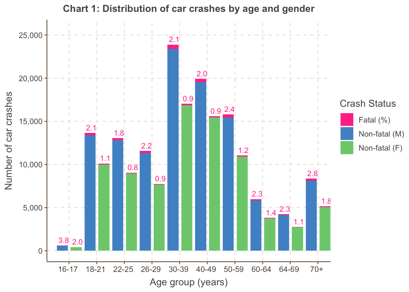
Chart 1 shows both the volume of accidents and the fatal proportion
are higher for males than females, across all age groups. Fatal
proportions are highest in the ’tail’ age groups across both genders:
the 16-17 age group, followed by the 70+ age group. Notably the 70+ age
group, despite being a lower proportion of the population of drivers,
has a relatively sizeable accident volume.
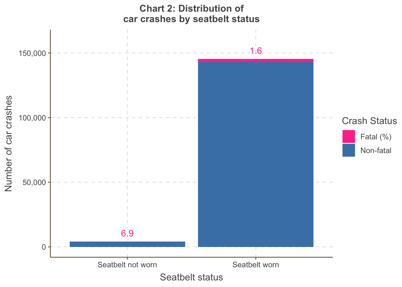
Chart 2 shows the fatal proportion is unsurprisingly much higher if
the driver does not wear a seatbelt.
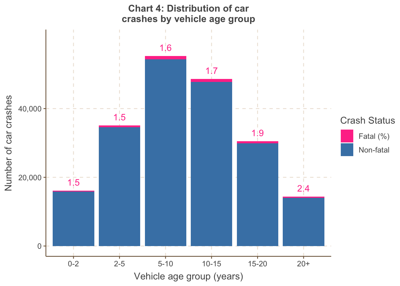
Chart 3 shows the proportion is highest for heavy vehicles and
single trailers, which seems reasonable as these would inflict the
greatest damage.
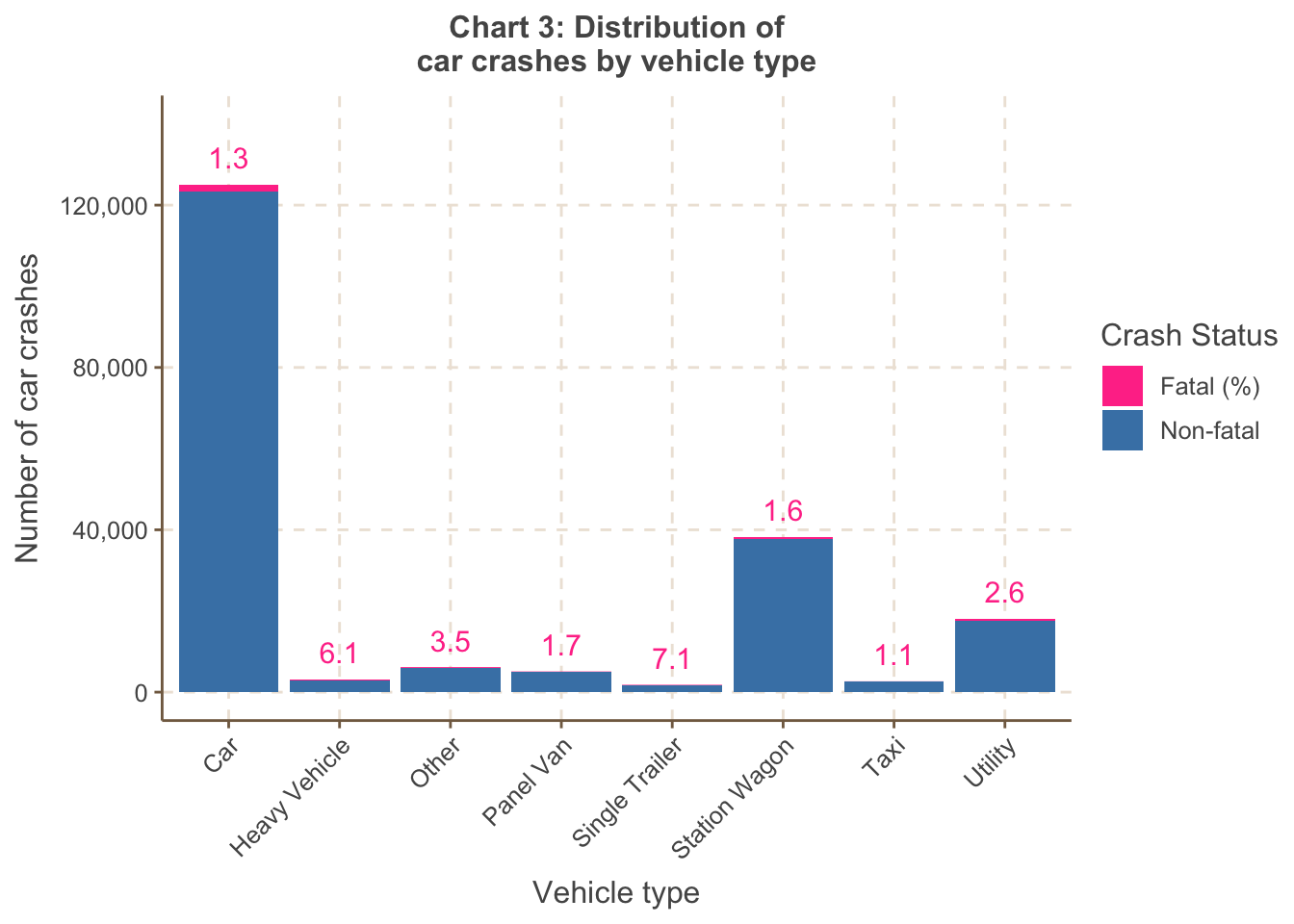
Chart 4 shows the number of accidents is higher across vehicles in
the 5-10 and 10-15 age groups. This may be due to the combination of 1)
more vehicles in these age groups on roads but also 2) vehicles of this
age lacking the latest safety features - this is corroborated by the
increasing trend in the fatal proportion as the age of the vehicle
increases.
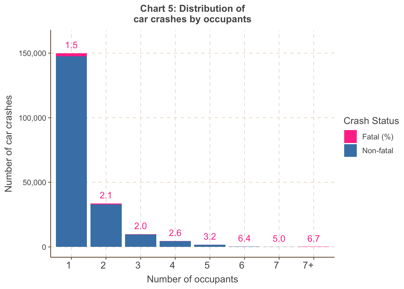
Chart 5 shows the fatal proportion increases with a greater number
of occupants. This suggests that once an accident occurs, there is
greater risk of a fatality due to higher exposure (in the form of more
occupants). However, the accident volumes are small for 3+ occupants, so
care is needed in interpreting this trend.
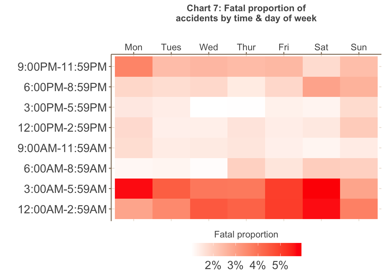
Chart 6 shows the highest volume of accidents occur on weekdays,
particularly between 3PM and 6PM (peak hour) - more accidents also tend
to happen later in the working week. However, as shown in Chart 7 below,
the greatest proportion of fatal accidents occur in the early morning
between 12AM to 6AM, particularly on Fridays, Saturday and Mondays, that
is, periods of greater fatigue.
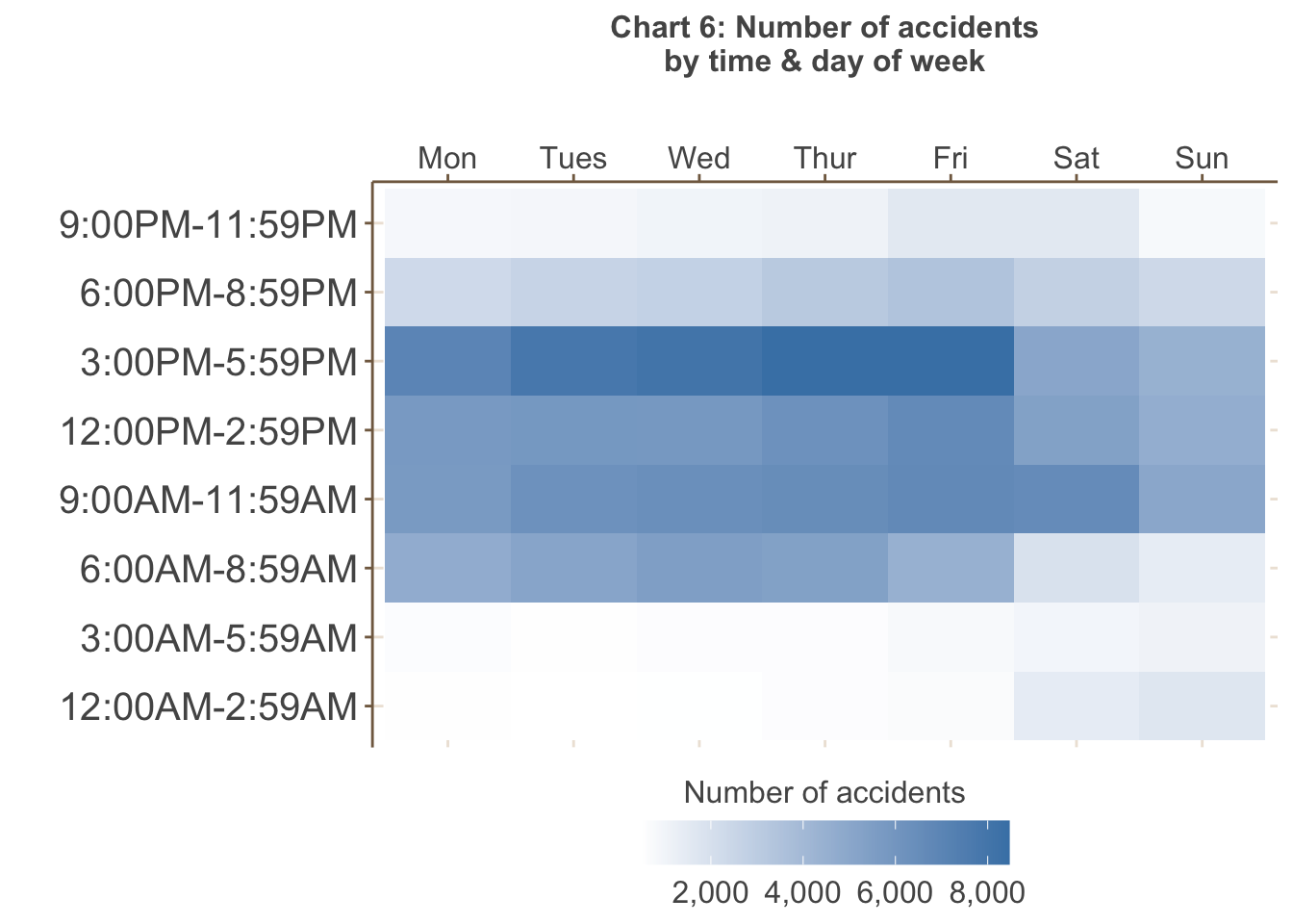
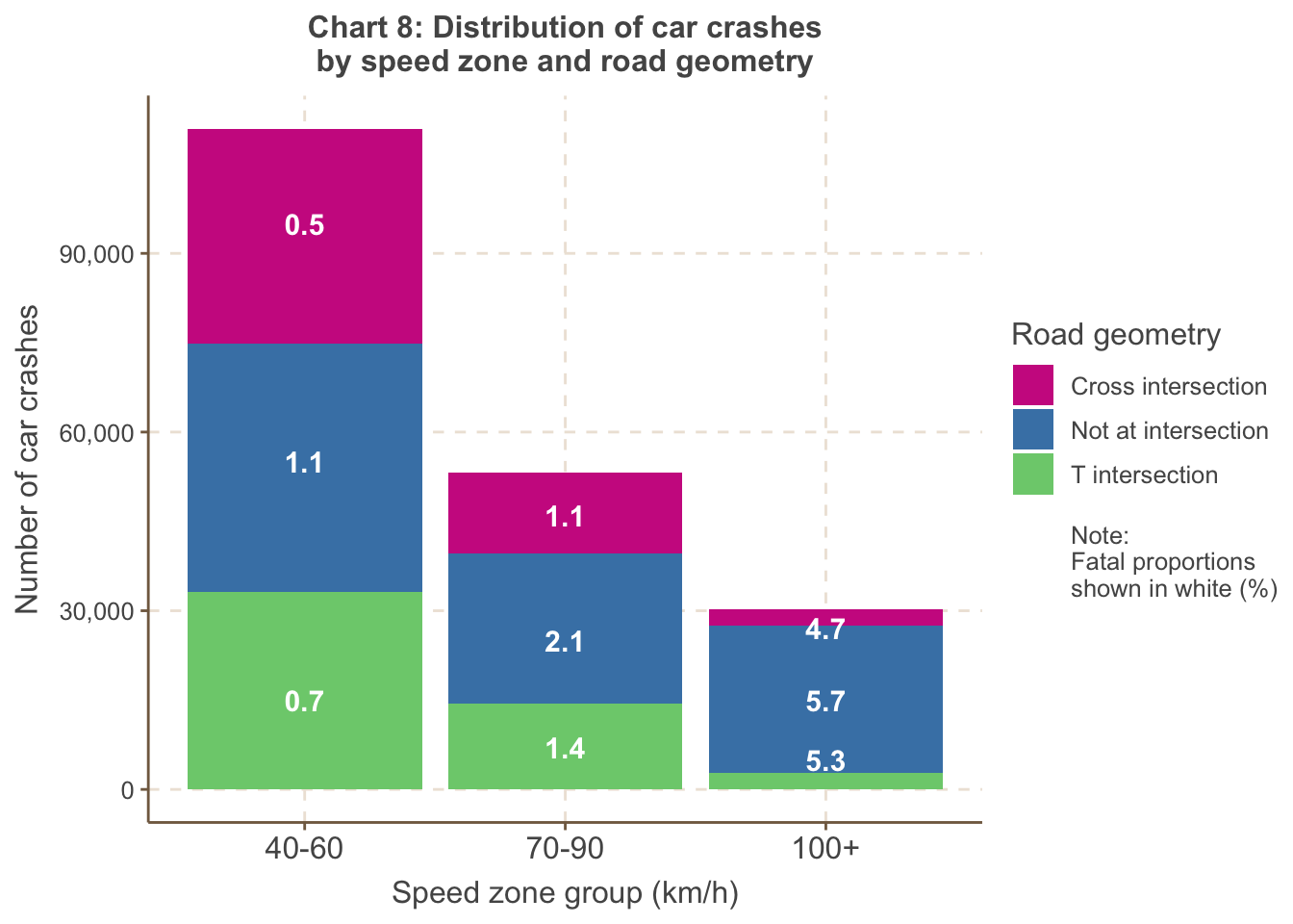
Chart 8 shows the proportion of fatal accidents is highest at high
speed zones of 100km/h or higher, the majority of which do not occur at
intersec- tions. In addition, the proportion of fatal acci- dents is
always lowest at cross intersections for all speed zones, most likely
due to how cross inter- sections encourage precautionary behaviour (with
traffic lights, etc.).\
From the above visualisations, it is clear the data is imbalanced as a very small proportion of accidents are fatal (in total, less than 2%). This has implications for both inference-based modelling as well as predictive modelling, which is discussed further in the following sections.
Example 2 - plotly examples
library(plotly)
library(htmlwidgets)

combi <- read.csv("Melbourne_housing_data_cleaned.csv")

# Create a correlation matrix
correlation_matrix <- cor(combi[, c("Price", "Rooms", "Bathroom", "Car", "Landsize")])

# Create an interactive heatmap
heatmap <- plot_ly(z = correlation_matrix, x = colnames(correlation_matrix), y = colnames(correlation_matrix),
                   type = "heatmap", colorscale = "RdYlBu")

# Customize the layout
layout <- list(
  title = "Interactive Heatmap of Correlations",
  xaxis = list(tickangle = 45),
  yaxis = list(tickangle = 45)
)

# Create and display the interactive plot
plot_heatmap <- heatmap %>% layout(layout)

saveWidget(plot_heatmap, file = "heatmap.html")
library(plotly)
# Assuming your dataset is named 'combi'
# Group data by CouncilArea and calculate the count of properties
council_area_data <- combi %>%
group_by(CouncilArea) %>%
summarize(Count = n())
# Create a sunburst plot
sunburst_plot <- plot_ly(
ids = council_area_data$CouncilArea,
labels = council_area_data$CouncilArea,
parents = "",
values = council_area_data$Count,
type = 'sunburst'
)
# Customize the sunburst plot
sunburst_plot <- sunburst_plot %>%
layout(
margin = list(l = 0, r = 0, b = 0, t = 0),
sunburstcolors = colorRamp(c("lightblue", "blue"))
)
# Create and display the interactive sunburst plot
saveWidget(sunburst_plot, file = "sunburst.html")Example 2
- This second example utilises the Melbourne housing market dataset. Note the code below does not include the pre-processing stage, which is necessary as the raw data from Kaggle has missing values.
- It utilises interactive map libraries
library(leaflet)
library(htmlwidgets)

melb <- read.csv("Melbourne_housing_data_cleaned.csv")

melb$Price <- as.character(melb$Price)

# Define a color palette
colors <- colorRampPalette(c("lightblue", "navy"))  # Adjust the color range as needed

library(leaflet)
library(RColorBrewer)  # You'll need this package for color scales

# Assuming you have a dataset 'melb' with columns 'Longitude' and 'Latitude'
# Convert the 'Price' column to character
melb$Price <- as.numeric(melb$Price)

# Define a color palette
library(leaflet)

# Define a custom color palette for Price
# Define the number of color steps and labels you want
library(leaflet)

# Define a custom color palette for Price
custom_palette <- colorNumeric(
  palette = c("steelblue2", "white"),  # Your custom colors for low and high values
  domain = melb$Price
)

# Create the map
m <- leaflet(melb) %>%
   addTiles(urlTemplate = "https://{s}.basemaps.cartocdn.com/light_all/{z}/{x}/{y}.png") %>%
  addCircleMarkers(
    lng = ~Longitude,
    lat = ~Latitude,
    popup = ~Price,
    radius = 3,
    color = ~custom_palette(Price)) %>%
    addLegend("bottomright", pal = custom_palette, values = ~Price,
    title = "Price (AUD)",
    labFormat = labelFormat(prefix = "$"),
    opacity = 1)

# Save the Leaflet map as an HTML widget
saveWidget(m, file = "leaflet_map.html")
Example 3
This slideshow contains visualisations created using two datasets. The first is the Melbourne housing market dataset. The second is cash rate data from the RBA. The rationale for using the cash rate data was to overlay the time series analysis of property sales.
Some of the interactive plots were creating using tableau, but you can replicate them with the interactive plot techniques we have introduced.
Template title
- Template video here.